18 Color Pairings That Could Ruin Your Living Room’s Aesthetic
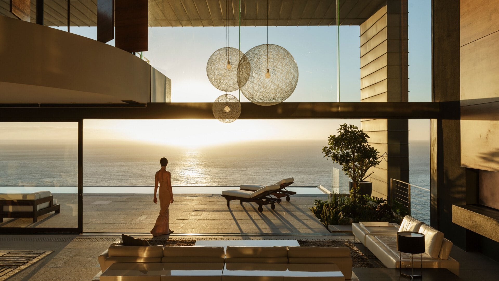
The colors you pick for your living room can completely change how the space feels. But sometimes, the wrong colors can make the room seem cluttered or too busy. On the other hand, choosing the right colors can make the room feel cozy, calm, and welcoming. The good news is that with a little thought and planning, you can get the exact feel you want. By paying attention to your color choices, you can create a living room that feels just right for relaxing or spending time with friends and family.
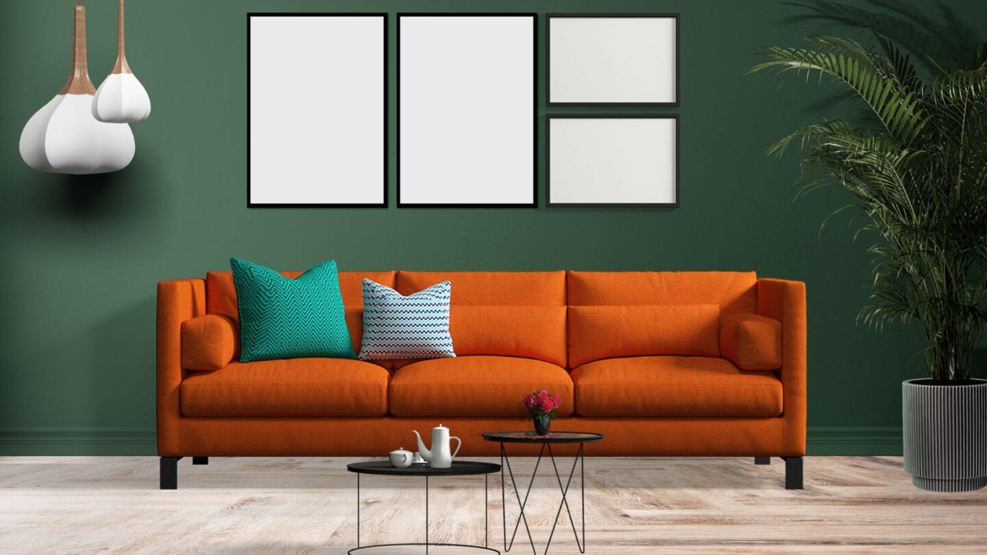
Bright Orange and Aqua Blue

Though both are striking colors, bright orange and Aqua Blue can clash, creating a visually jarring effect. The warm tones of bright orange may compete with the coolness of aqua blue, leading to a discordant and overwhelming atmosphere. This combination might be too stimulating for a relaxing living room environment and can distract from other design elements. Careful consideration of the shades and balance is essential to prevent this combination from overpowering the room.
Red and purple

Due to the strong contrast between these bold colors, combining red and purple in your living room decor can create a jarring and overwhelming visual clash. Instead of pairing them, opt for complementary hues or analogous shades that harmonize more seamlessly. Consider incorporating touches of red or purple as accents rather than dominant colors to add depth and interest to your space without overwhelming it.
Yellow and orange

While yellow and orange can bring warmth and energy to a room individually, using them in your living room decor can create an overly intense and chaotic atmosphere. To avoid overwhelming your space, opt for softer shades of yellow and orange or incorporate them sparingly as accent colors. Consider pairing these hues with neutral tones like white, beige, or gray to balance their vibrancy and create a more cohesive look.
Neon Pink and Light Pink

Pairing neon pink with light pink in your living room may create a bold yet unbalanced look due to their contrasting brightness levels. The vibrant intensity of neon pink could overpower the subtlety of light pink, leading to a disjointed and overwhelming space. To maintain harmony, use neon pink as an accent against neutral tones or introduce it in small doses to prevent it from dominating the room. Achieving a balance between these hues is crucial for a cohesive and visually appealing living room design.
Olive Green and Mustard Yellow

While individually rich and warm tones, olive green and mustard yellow can create a lackluster and uninviting atmosphere when paired. The muted nature of olive green might clash with the boldness of mustard yellow, resulting in a dull and uninspired space. This combination may need more vibrancy and liveliness to energize the living room, making it stagnant and outdated.
Brown and Dark Purple

While brown and dark purple are individually sophisticated colors, they can create a heavy and oppressive atmosphere when paired. The richness and depth of both hues may result in a dark and enclosed space lacking lightness and airiness. This combination can make the living room appear smaller and less welcoming, especially if not balanced with lighter tones or ample natural light. Consider incorporating lighter accents or contrasting colors to prevent the room from feeling overly somber and cramped.
Red and Green

While traditionally associated with the festive spirit of Christmas, red and green can create a visually overwhelming and outdated atmosphere when used in excess. This combination might evoke a sense of holiday kitsch rather than sophisticated living room decor without carefully considering the shades and balance. Additionally, the strong contrast between red and green can be visually fatiguing and may lack the subtlety needed for a relaxing environment.
Navy Blue and Coral Pink

Pairing navy blue with coral pink in your living room might initially sound intriguing, but it often leads to clashing rather than complimenting. The deep intensity of navy blue can overpower the vibrancy of coral pink, causing visual chaos in the space. To avoid this, opt for softer or more complementary hues that create a harmonious atmosphere. Remember, the goal is to craft a living room that feels inviting and cohesive, so selecting the right color combinations is essential.
Black and Navy Blue

While dark and elegant, black and navy blue can create a space that feels overly unhappy and lacking in warmth when used together. The deep saturation of these colors can make the living room feel closed in and claustrophobic, especially if not balanced with lighter accents or ample lighting. Without careful consideration of contrast and texture, this combination might result in a flat and uninspired space rather than cozy and inviting.
Red and Gray

When used together, bright red and yellow can create a visually overwhelming and overly stimulating environment in the living room. These hues’ high energy and intensity may clash, creating a chaotic and disorganized space. Additionally, the combination of bright red and bright yellow can evoke a sense of aggression and tension rather than the desired sense of warmth and comfort. It’s essential to use these colors judiciously and balance them with neutral tones to prevent the living room from feeling overpowering.
Lime Green and Gray

Pairing lime green with gray in your living room can be bold, but it often leads to a clash of tones, disrupting the overall look. Lime green’s vibrancy might overshadow the subtlety of gray, creating an unbalanced and overwhelming atmosphere. To create harmony, use lime green as an accent against neutral tones or pair it with softer shades like light gray. Achieving a balance between these colors is essential for a visually appealing and cohesive living room design.
Brown and Orange

Depending on the shades chosen, the combination of brown and orange can evoke a sense of nostalgia for 70s decor. While these earthy tones can warm a space, they may feel outdated and reminiscent of a bygone era when used together without careful consideration. The key is to balance brown’s richness with orange’s vibrancy to create a harmonious and contemporary living room decor that pays homage to the past without feeling stuck in it.
Orange and Olive Green
Orange and olive green are challenging color combinations for a living room because these tones can clash and create an unharmonious environment. Orange, a vibrant and energetic color, can easily overpower the more subdued and earthy tones of olive green. This contrast can make the room feel disjointed and chaotic rather than cohesive and relaxing.
Hot Pink and Light Green
Hot Pink and Light Green can create a jarring and unappealing contrast in your living room. Hot pink is a bold, intense color that demands attention, while light green is soft and soothing. When paired, these colors can clash rather than complement each other, resulting in a visually chaotic and unbalanced space. The stark difference in their intensity can make the room feel disorganized and uncomfortable rather than inviting and harmonious.
Teal and Red

Teal and red, though vibrant, are highly contrasting colors that can create visual chaos when paired together. Their intense hues can clash, making the room feel overwhelming and unsettling rather than harmonious. This pairing often fails to provide a cohesive look, disrupting the balance and aesthetic appeal of the living room. Instead of complementing each other, teal and red compete for attention, leading to a disjointed and unappealing space.
Green, Gray, and Natural Tones
Using green, gray, and natural tones in your living room might seem stylish, but it often falls flat. These colors lack the contrast to create visual interest, making the space dull and uninspiring. Green, while calming, doesn’t provide the necessary pop to break up the natural tones, causing everything to blend in a boring way. This palette can make furniture and decor lose definition, creating a cluttered and indistinct appearance.
Charcoal Gray and Mustard
Using charcoal gray and mustard in your living room can be risky. The dark, heavy tone of charcoal gray can overpower the space, making it feel gloomy and closed in. When paired with mustard, a bold and intense color, the combination can create a harsh, jarring contrast on the eyes. Instead of complementing each other, these colors can clash, creating a chaotic and unbalanced look. The stark difference between the coolness of charcoal gray and the warmth of mustard can also make it challenging to create a cohesive and harmonious decor.
Taupe and Dark Green

Being a muted and neutral shade, Taupe can make the space feel dull when paired with the heavy, dark green. This combination often lacks the necessary contrast to create a vibrant and inviting atmosphere, making the room look somber and uninspired. The earthy tones of taupe and dark green can blend together too seamlessly, resulting in a lack of visual interest and definition. Overall, this color pairing can struggle to bring the dynamic and cohesive look needed for a lively living room.
More For You

As you contemplate interior color choices, remember to extend your design considerations to the exterior of your home. Refreshing your house’s exterior walls with a new coat of paint and embellishing it with vibrant flowers and lush greenery can elevate its curb appeal and create a welcoming atmosphere when guests arrive.
This article was first published at RB ITALIA Blog.