Fall Mantle Decor in White, Brass and Green
No orange. That was the only rule I gave myself with this one, and it turns out that’s the whole trick to a fall mantle that doesn’t look like a craft store.
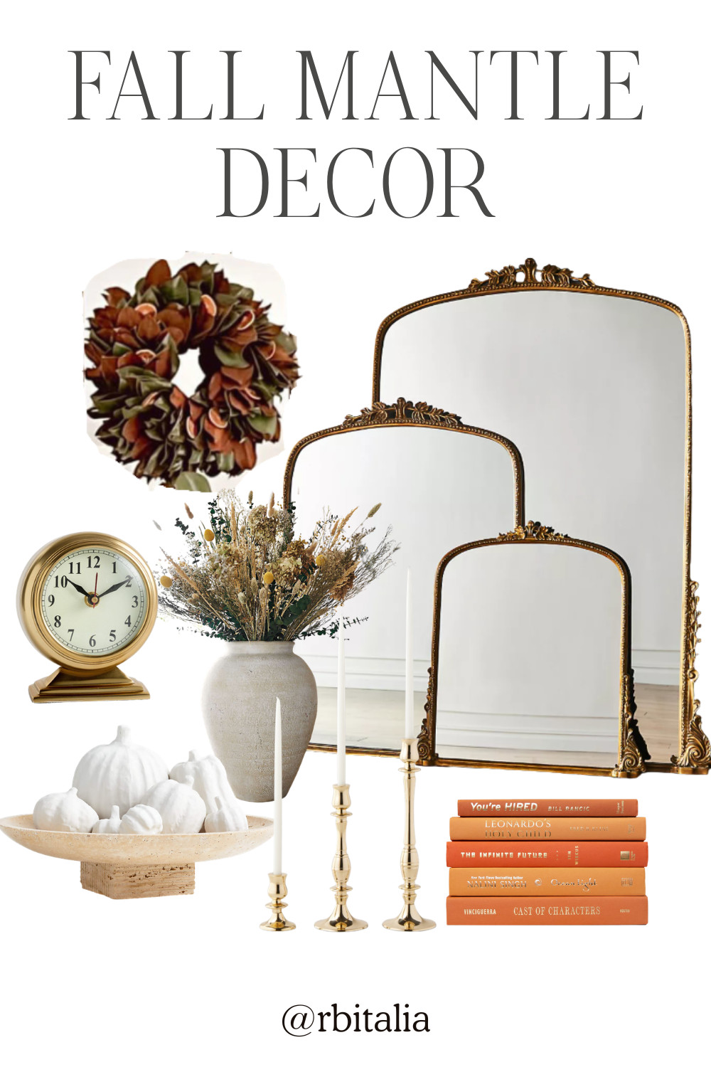
White, brass, and green instead. It still reads autumn, it just doesn’t shout it.
Everything starts with what’s above the mantle, which is the part people skip. The Anthropologie Gleaming Primrose mirror fills that space and bounces light back into the room, which a piece of art can’t do.
Magnolia garland is the green. This one from Etsy is fresh and extra full, and fresh matters because faux garland is the single easiest thing to spot as fake. It lasts a couple of weeks, so treat it as something you do for a season rather than something you store.
The Crate and Barrel Ophelia vase in matte white is seventeen inches, which is taller than most people go, and that’s exactly why it works. A mantle needs one thing with real height or the whole surface reads flat.
White pumpkins instead of orange ones. The paper mache set of seven lets you scatter them at different heights rather than lining them up like soldiers, and seven is the right number because odd groupings look styled and even ones look arranged.
Brass is the warmth. The Williams Sonoma tiny taper holders are small and you want several, clustered rather than spread out.
The Chris Loves Julia metal desk clock gives you something with weight on one end, so the mantle isn’t symmetrical. Symmetry is what makes a mantle look like a hotel lobby.
And a book stack under the vase or beside the clock. The Latitude Run Canyon set is orange, which breaks my own rule, and I’d argue it’s the one place to break it. One warm accent in a room of white and green is the difference between calm and cold.