15 Ways How Home Colors Can Improve Your Mental and Emotional Health
Did you know the colors in your home can strongly impact how you feel? Many of us choose colors based on style or personal taste, but the shades we pick can also influence our mood, energy, and mental health. Certain colors can create a calm atmosphere, boost your mood, or even bring a sense of energy to a space, changing how we experience our surroundings. In this article, we’ll look at surprising ways different colors in your home can affect your emotional and mental well-being every day.
The Mood-Enhancing Power of Blue

Blue is commonly connected to tranquility and peace. Its cool hues can decrease heart rate and alleviate anxiety, making it ideal for spaces like bedrooms and bathrooms where relaxation is crucial. Blue is also linked to productivity and focus, so it’s commonly used in home offices. However, too much blue can feel chilly or distant, so balancing it with warm accents can create a more welcoming atmosphere. The psychological effect of blue generally induces a peaceful state, which can significantly improve your mental well-being.
Embracing Warmth Through Earthy Tones
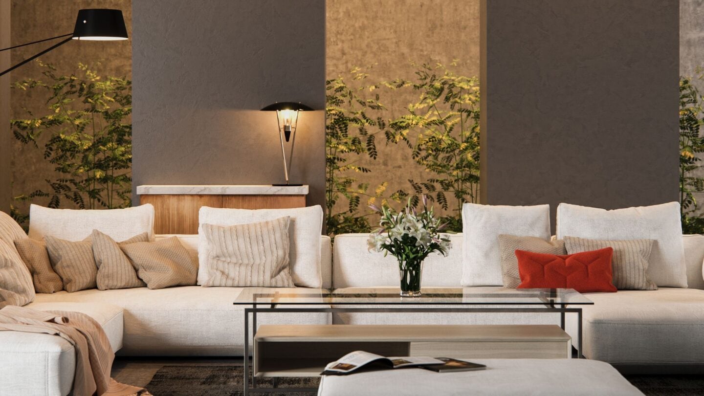
Earthy tones like terracotta, olive green, and warm browns ground a space, bringing a sense of stability and warmth. These colors are reminiscent of nature, which can help reduce stress and promote comfort. They’re ideal for living rooms and kitchens where social gatherings occur, as they foster a cozy and inviting environment. Earthy shades can enhance security and cohesion, reflecting nature’s vital, nurturing aspect. By incorporating textures like wood or stone along with these colors, you can amplify their comforting effects. The organic nature of earthy tones connects well with our intrinsic love for nature, enhancing emotional well-being.
Energize Your Space with Vibrant Reds

Red is a vibrant color linked to energy, passion, and excitement. It’s best used in moderation as an accent because an excess of red can lead to feelings of anger or irritation. Integrating shades of red with balance and careful placement can invigorate a space without overwhelming it. The psychological impact of vibrant reds can promote vitality and enthusiasm, fostering a lively atmosphere that enhances social interactions.
The Calming Effects of Green

Green is synonymous with nature and is known for its calming and therapeutic properties. It is an ideal color for almost any space in the home, bringing a sense of freshness and renewal. Often used in living rooms and home offices, green promotes tranquility and can help with concentration and balance. A harmonious combination of green with natural elements can enhance your connection to the earth, promoting overall well-being.
Yellow Can Boost Your Happiness

Yellow, reminiscent of sunshine, is linked to joy, positivity, and creativity. Despite its uplifting nature, an overabundance of yellow can become overpowering and might provoke emotions of frustration or irritation. Using yellow as an accent or combining softer shades with other colors is beneficial to maintain balance. Yellow’s bright and cheerful nature can elevate mood and encourage positivity, making it an excellent choice for spaces where you want to feel invigorated and inspired.
Finding Balance with Neutral Shades

Neutral shades like beige, gray, and taupe offer versatility, creating a sense of calm and sophistication without drawing too much attention. Neutrals can unite diverse elements in decor, allowing for creative flexibility in other design choices. The subtle psychological impact of neutral colors provides a stress-free background that promotes equilibrium and allows the mind to relax. Ideal for any room, they are timeless and classic, forming the foundation of a peaceful home environment where well-being can thrive.
Using Purple for a Touch of Luxury and Relaxation

Purple is often associated with luxury, creativity, and spirituality. Light lavenders bring a peaceful, whimsical atmosphere to bedrooms or meditation spaces, while deeper purples add a sense of luxury and depth. Purple can stimulate imagination and convey a sense of richness without being overbearing. Its regal nature can enhance introspection, making it ideal for spaces where you’d like to inspire thoughtfulness and reflection. Coupling purple with complementary colors can further amplify its luxurious feel, promoting a serene and rich environment conducive to mental peace and relaxation.
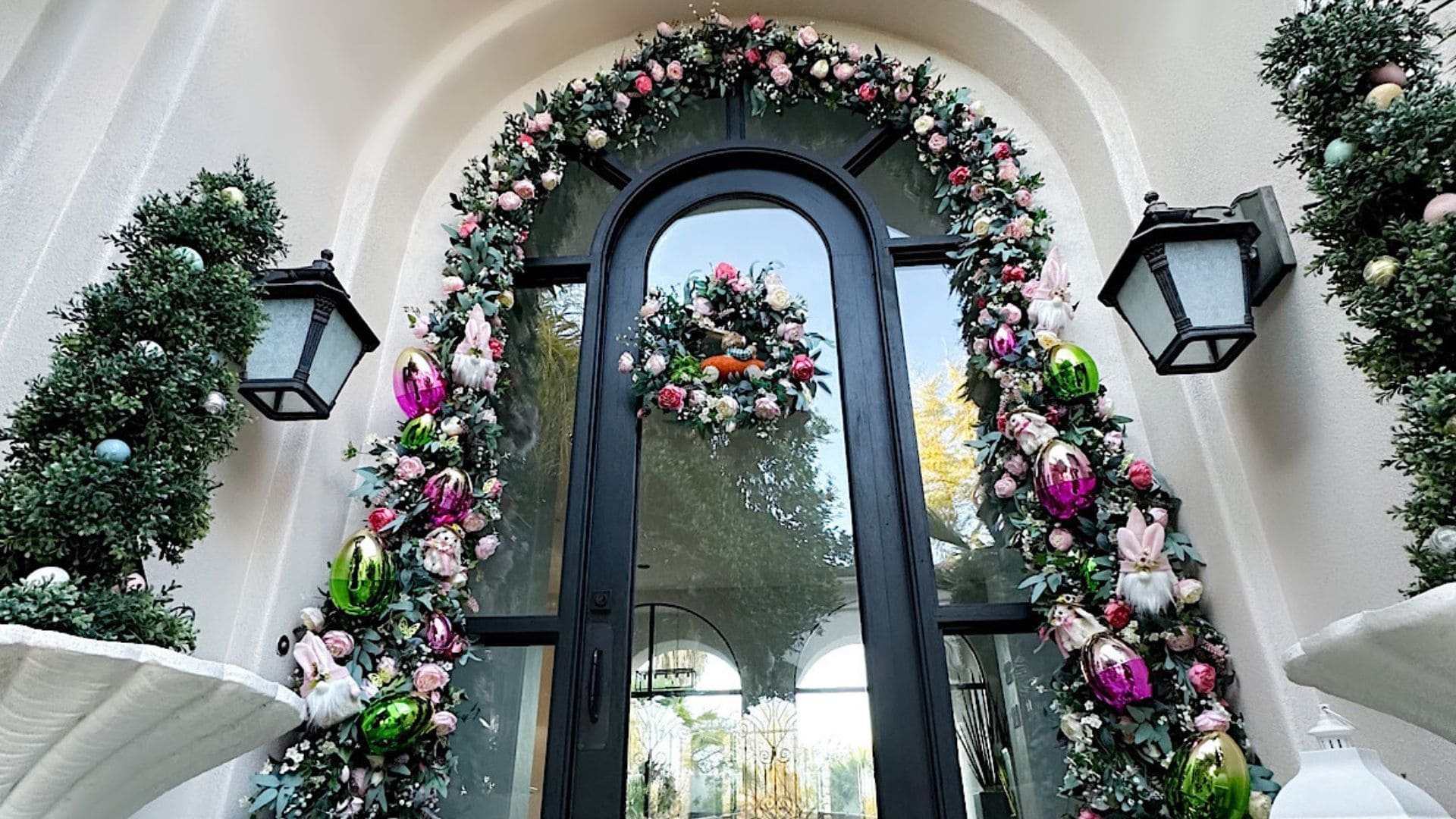
Soft Pinks for Comfort and Care

Soft pinks are nurturing and compassionate, creating a warm and inviting atmosphere. Often associated with love and innocence, pinks can bring a gentle, soothing energy to spaces like bedrooms or children’s rooms. They are known to promote feelings of warmth and care while adding an element of charm and playfulness. The psychological effects encourage comfort and emotional comfort, healing emotional wounds with their gentle presence. Pink and neutral tones can create a balanced and refreshing space that resonates with unconditional support and tenderness.
Color Saturation: Its Powerful Influence on Mood
Highly saturated colors are bold and vibrant, capturing attention and energizing the environment. They’re perfect for energizing areas such as a home gym or creative workspace. However, if overused, they can be overwhelming and lead to sensory overload. In contrast, muted or desaturated colors are calming, creating a soothing atmosphere for relaxing areas like bedrooms and reading nooks. They offer sophistication and subtlety, allowing for a more contemplative and restful mindset. Choosing the right saturation level can effectively regulate the energy and emotion of a space, enhancing mental clarity and emotional balance.
Beige for a Cozy Vibe

Beige is one of those colors that just feels timeless. It brings warmth and calm without being too much, making it a great choice for bedrooms or living areas where you want to relax. The best part? Beige goes with almost anything, so you can easily switch up your decor whenever you want. Its soothing nature makes it the perfect backdrop for creating a peaceful, inviting space where you can truly unwind. Whether you prefer modern or traditional styles, beige always manages to fit right in. It’s the kind of color that feels like a warm hug after a long day.
Playful Turquoise for a Fun Pop of Color

Turquoise is a happy mix of blue and green that brings both calm and energy into a room. It’s perfect for areas where you want to inspire creativity and playfulness, like kids’ rooms or craft spaces. The color feels fresh and fun without being overwhelming, especially when paired with whites or neutrals. Adding turquoise to your home can brighten things up and make the space feel more lively and uplifting. It also has a way of reminding you of the ocean, adding a little touch of serenity to your day. Whether you go bold or keep it subtle, turquoise can really make a space feel cheerful.
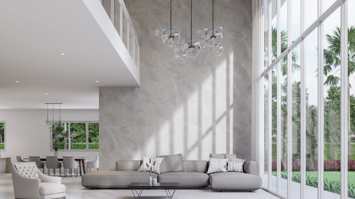
White For A Sense of Space and Clarity

White is often used to create a sense of openness and clarity. White can serve as a clean backdrop that allows other design elements and color accents to stand out, providing flexibility in interior design. Its association with purity and simplicity promotes a clean, organized environment that can help reduce stress and enhance focus. However, too much White can feel stark or sterile, so it’s essential to incorporate textures and softer colors to add warmth and comfort. The fresh and airy effect of white promotes mental clarity and peace, optimizing well-being.
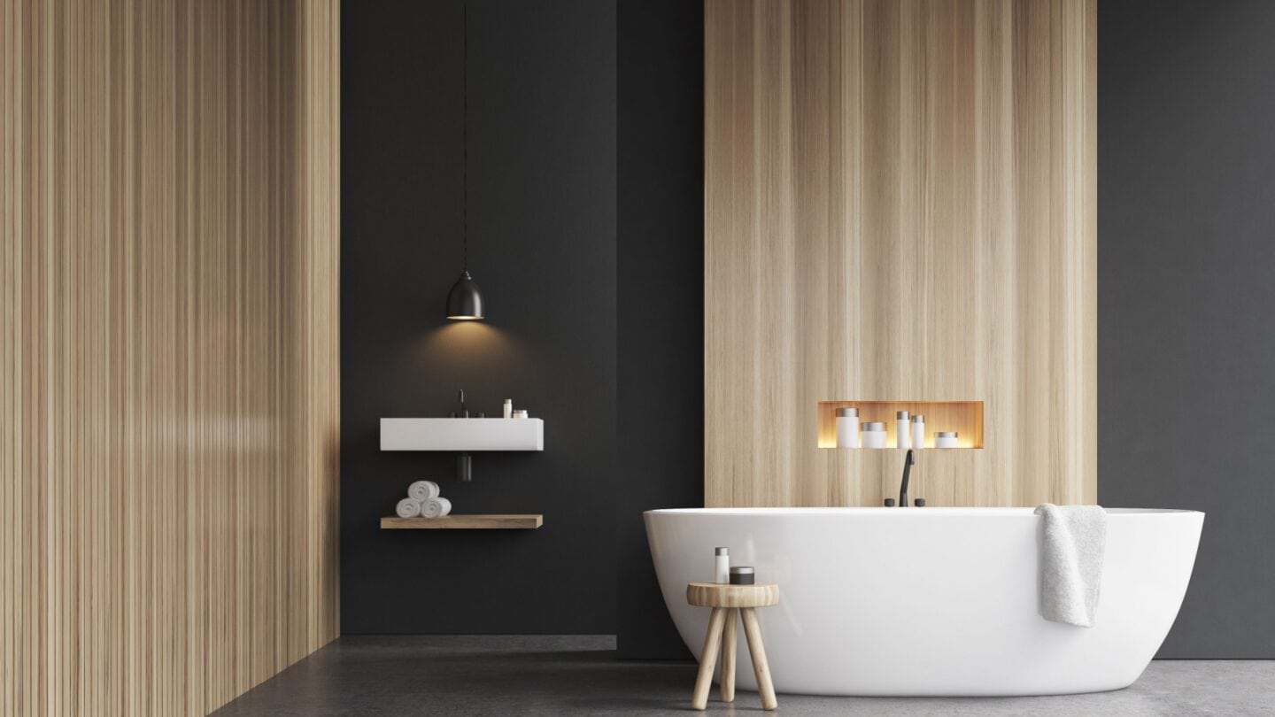
Black and Dark Hues: Creating Depth and Sophistication

Black and other dark colors add depth and sophistication to a room. They can create a dramatic contrast with lighter colors, adding visual interest and making spaces feel grounded. Dark hues can also evoke elegance and richness, perfect for dining rooms and study areas. While too much darkness can make a space feel small or closed in, using it strategically—such as on an accent wall or in decor elements—can promote a sense of intimacy and coziness. The psychological effects of black and deep hues include boosting concentration and creating a calming, reflective environment.
Unconventional Color Choices for Unique Personal Expression

Unconventional colors, such as vibrant oranges or unexpected jewel tones, allow for personal expression and bring personality to a space. These colors break traditional norms, offering creative and unique environments that stimulate discussion and innovative thinking. They can be effectively used in areas where individual character and flair are desired, such as an artist’s studio or a modern living room. While unconventional choices can be bold and exciting, they should be balanced with neutral elements to prevent overwhelming the senses. These colors reflect individuality and creativity, often inspiring and promoting a joyful and dynamic atmosphere, which can significantly enhance well-being.
Soft Grays for Calm and Focus
Soft gray shades are perfect when you want a room to feel peaceful but not boring. They bring just the right balance—calming without being too cold or dull. Grays work especially well in places like home offices, bedrooms, or study areas, where you need both focus and relaxation. It’s a color that quietly supports creativity by keeping distractions to a minimum. Add a few colorful accents, and the space becomes even more inviting. With gray as your backdrop, everything feels a bit more grounded, making it easier to unwind or get things done. Also, it matches practically anything, so it’s easy to change up the vibe when you need a refresh.
More For You

Nicely painted home walls make you feel peaceful and happier, especially in the living room, where you spend most of your time. Here are some nice living room paint ideas you should consider.
This article was first published on the RB ITALIA Blog.